Roskam Foods
Roskam Foods is the leading co-manufacturer behind our favorite frozen, refrigerated, and shelf-stable food brands. After 100 years of building food brands under the radar, Roskam came to Latitude for a brand identity, one that marked an era of Multiplying Possibilities.
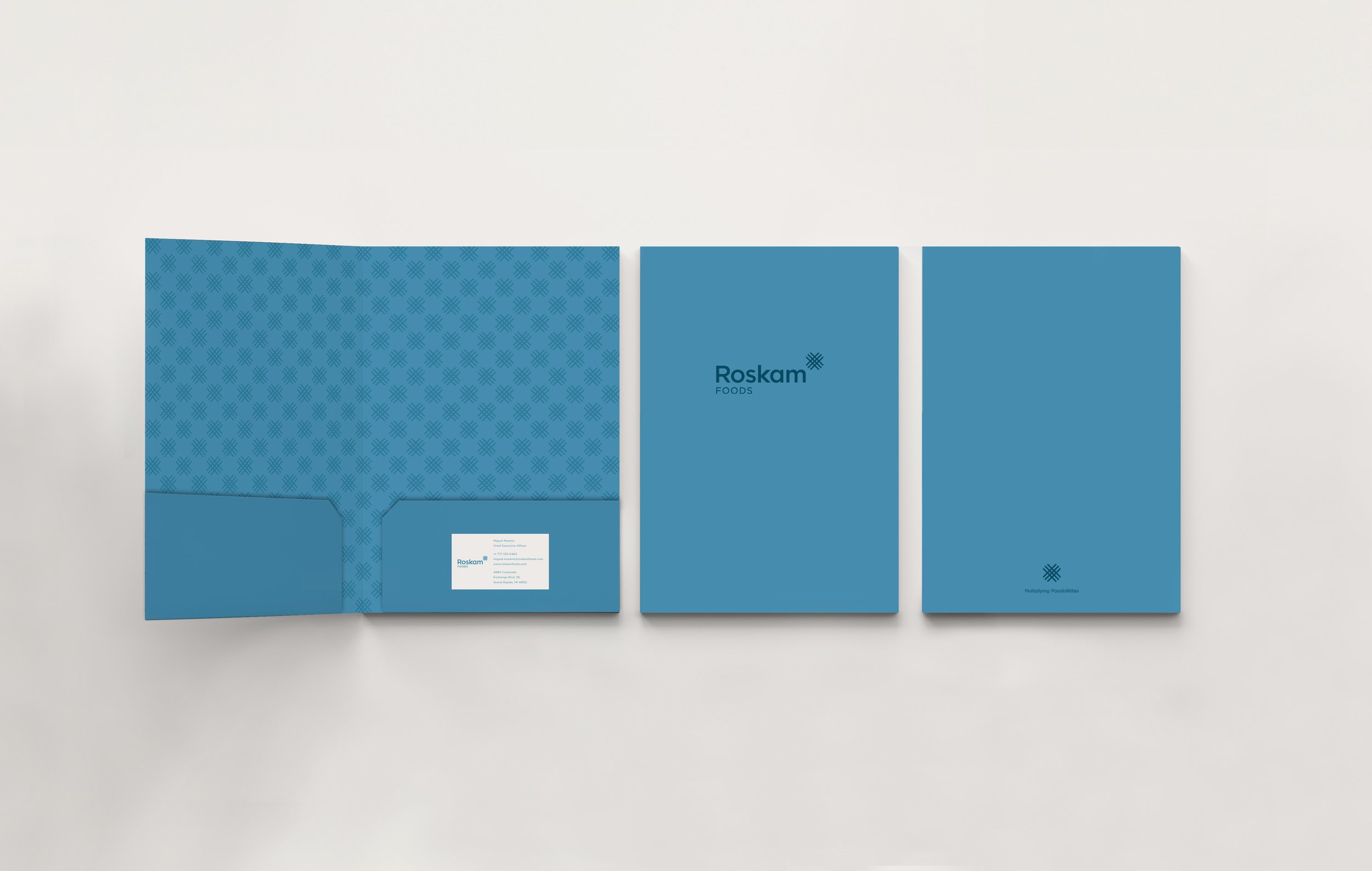
I worked closely with my creative director to design every aspect of this brand. We created fresh logos, patterns, printed materials, email design, and merchandise. We also redesigned the Roskam Foods website to reflect their new brand look and strategy.
Account Leads
Nick DiLorenzo and Betsey Ruesink
Strategist
Glenn Deering
Creative Director
Jason Strong
Designer
Maddie Markley

Breaking down the logo
-
Logo mark
Mono line lattice represents consistency and multiplying possibilities in the form of an “X.” The corners are softened to create a heart shape.

-
Hidden heart
Roskam is the co-manufacturer with Heart, generating value for all through a service mindset. The “hidden heart” highlights these values.

-
Key stakeholders
The logo reveals four focal points that represents the key stakeholders for Roskam: People, Customers, Community, and Shareholders.


